When I was a kid it was somewhere around the time when colour TVs were normal and VHS videos were starting to become affordable. We weren’t aware of black and white TVs and CDs weren’t a thing yet.
One day my parents brought home the new Bill and Ben video for us to watch. I was too little to remember but my parents say we were all eager to watch this new video. So we popped it in the VCR and as it started playing we all ran into the kitchen, where my parents were, shouting that the TV was broken.
Not understanding what was wrong we went back to the TV, parents in tow, and explained that the colour had disappeared and that the TV must be broken!
That was when we first learnt about black and white TVs.
Now I’m telling you this story because even though the yarn industry is so different to what it was back then, and colours are abound in hand dyed yarns and even commercial yarns nowadays, that when it comes to choosing your colours for colourwork knitting black and white (or more accurately greyscale) is still the best way to gauge if your colours will work well together. Whilst colour makes a contribution to the finished item, it is the contrast between the colours that really makes it stand out.
Contrast is the difference between dark and light shades. Black and white have the biggest contrast between them. But two medium greys have very little contrast between them.
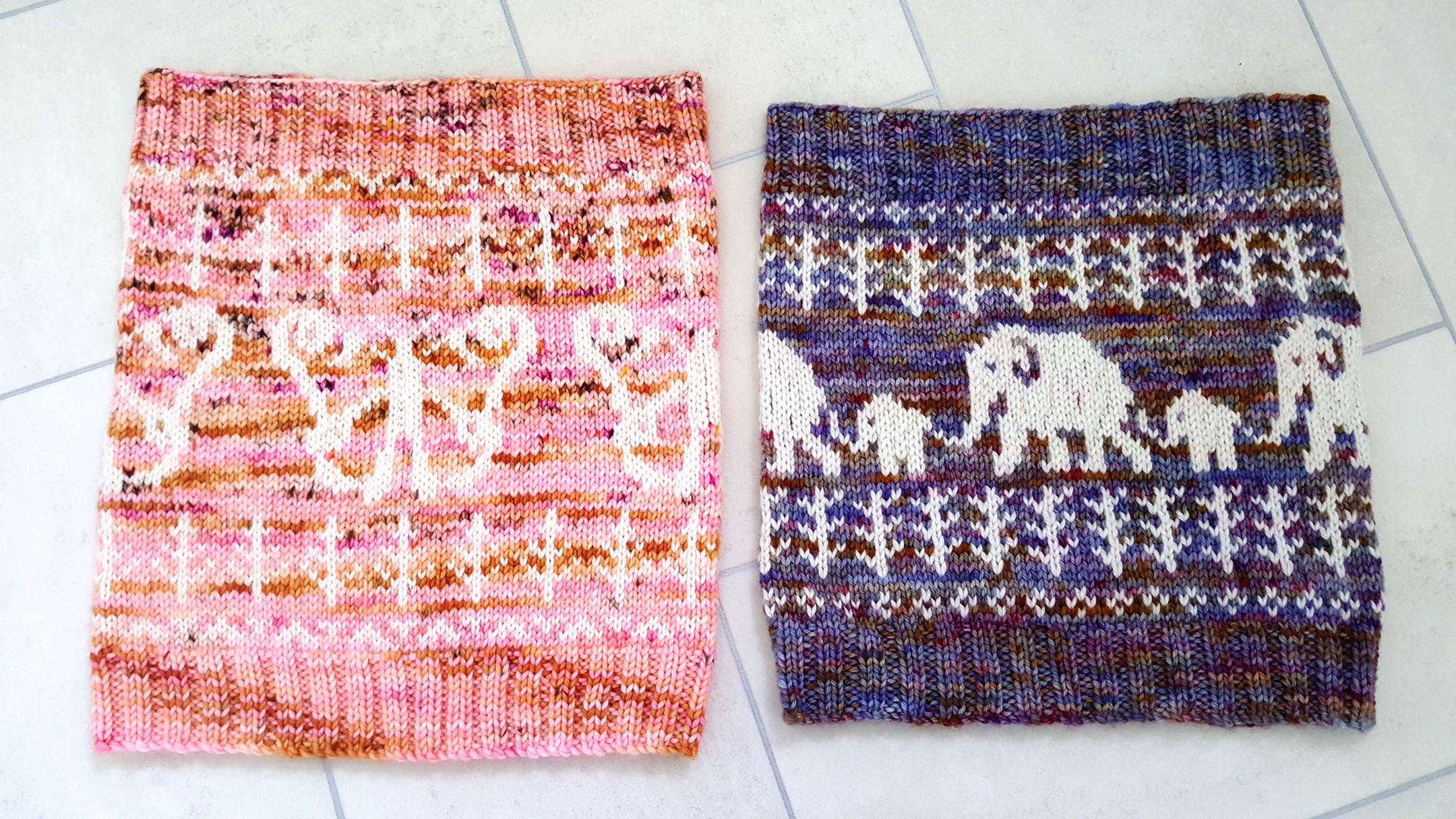
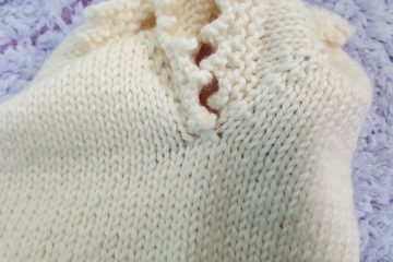
This is a lesson I have learnt along the way from experience. Remember the Soulful Transformation Cowl?
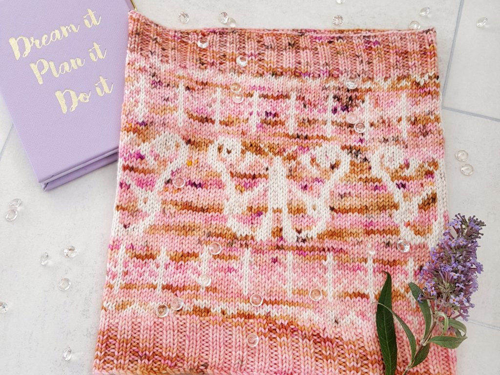
It was my second ever colourwork pattern and I made the unbeknownst to me mistake of choosing the wrong colours to partner up. In the colour world the two skeins looked good together. But knitted up the pattern gets lost and doesn’t look as good as it could have been.
This is because, whilst the colour skein does have some darker patches of pink and gold, it is mostly very pale in colour. There is very little contrast between the majority of the colour and the white. This is more evident when we look at the cowl through a greyscale filter.
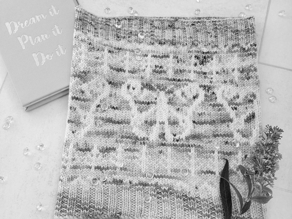
Had I checked my yarn choices through a greyscale filter I wouldn’t have continued with the white for the contrast colour. I would have chosen a very dark solid colour, maybe even black.
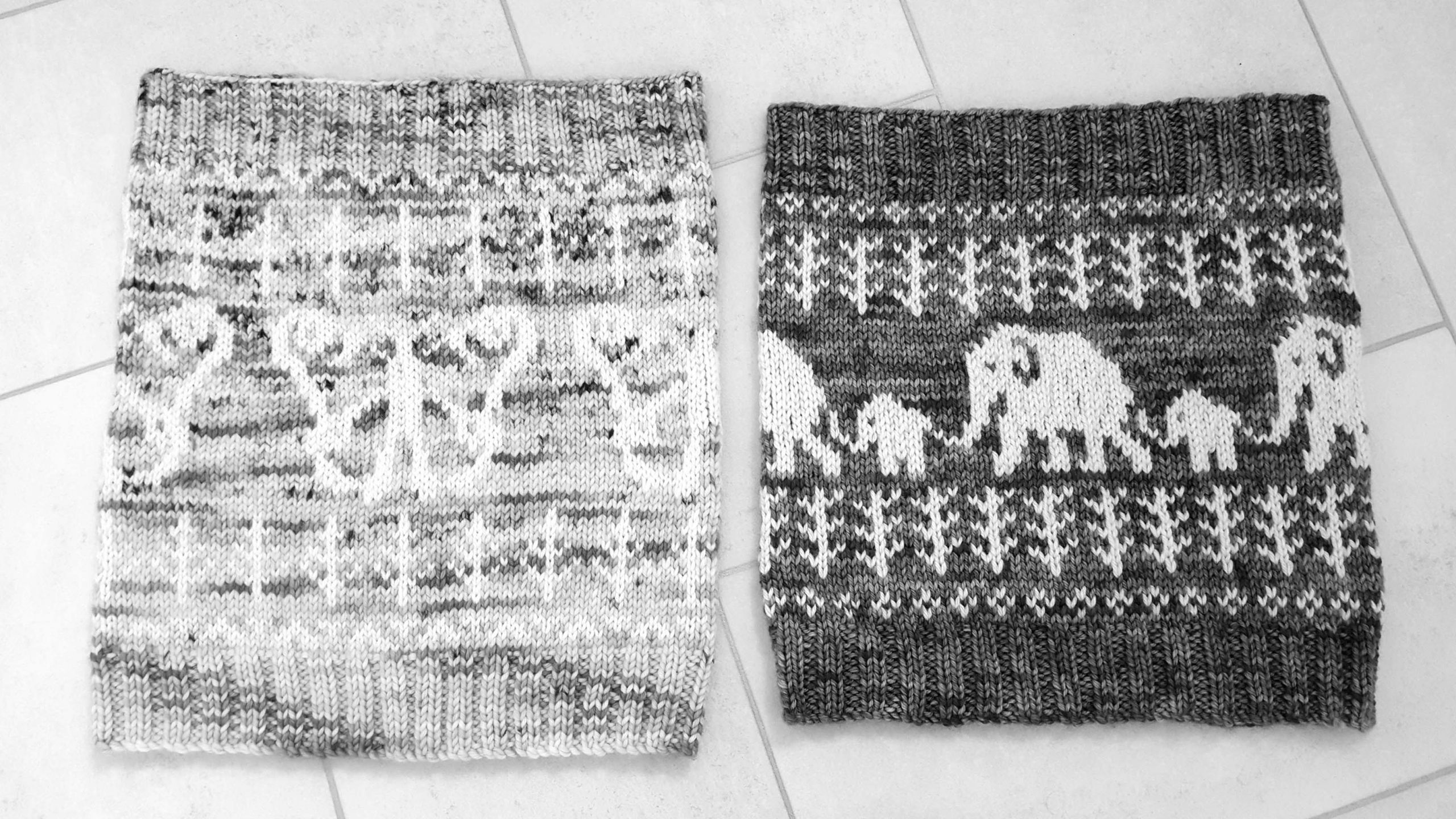
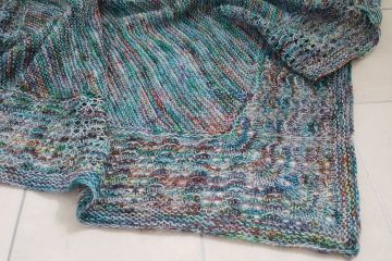
Now if we compare this with say the Never Forgotten Cowl, then the contrast can be seen very clearly. Use the slider on the below image to see the colour and greyscale versions. All of the colours in the colour version appear to have a very similar grey tone to them in the greyscale version. Whilst you can clearly pick out different purples, reds, and golds for example, in the greyscale version there is little difference.
BONUS: This tip can also be used when making a blanket up of different coloured squares to create an even distribution of contrast.
So next time you are creating a colourwork project I hope you’ll consider using a greyscale filter to check your yarn choices before starting your project.
Best wishes, – & happy crafting
Sam xox
When you sign up below you’ll get new blog posts directly into your inbox!
0 Comments